

Web design projects are complicated. They have lots of requirements, stakeholders and decisions. But the most important success factor, lead generation, is actually simpler than it seems.
Assuming you’ve attracted the right visitor, there are really just two two things that determine if they click on your call to action.
- Clarity: Answering your visitors questions, handling their objections
- Persuasion: Using supportive evidence, leveraging psychology and bias
This brief guide is a straightforward method for improving your conversion rates by focusing on those two key factors and rethinking how you present your pages.
We’ll stay 100% focused on the context of your visitor and the words that get them to click. It’s almost certain that with a few adjustments, even before you do A/B testing, you can increase the percentage of visitors who turn into leads on your website.
We’ll break down the elements in detail. But first, let’s lay them out visually on an example of a high-converting page with B2B lead generation goals.
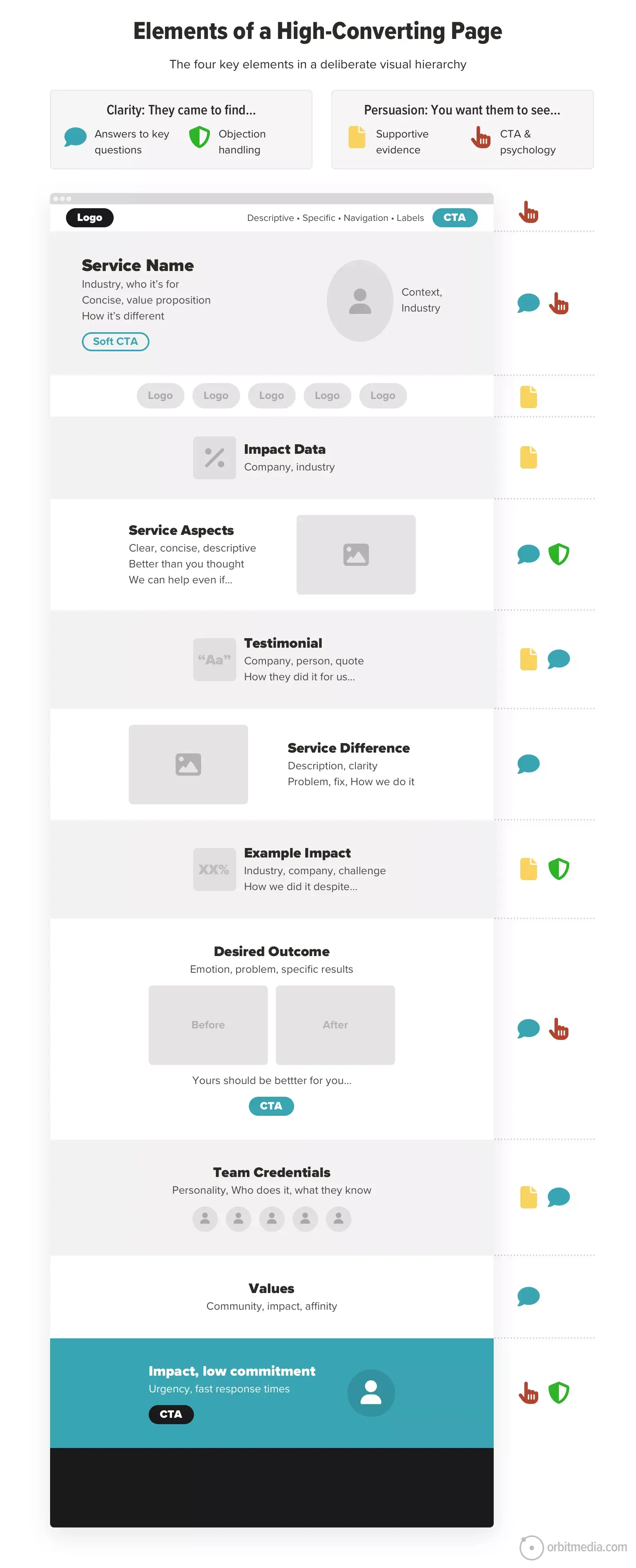
Now that we have the context, here’s the breakdown for website conversion optimization..
First, Clarity: The words they are looking for…
If you’ve never watched a session recording of a visitor browsing your website, you’re like the shopkeeper who has never seen a customer walk through the store. You can’t fully appreciate how fast visitors move. It’s incredible.
When your page loads, 100% of visitors start scanning, looking for certain words. They start at the top. They look in the navigation, the header, the subheads and in the paragraphs. And yes, that’s typically the order in which they scan your page. That’s the so-called “visual hierarchy” of your words.
If they don’t see their words, they’ll bounce. Every webpage has a back button.
If the visitor is even a little bit confused, their back button pulls their mouse like a magnet up and to the left, toward the exit. Remember, your visitor has many options. If they came from Google, they saw tons of those options on the previous screen.
Your visitor wants your page to do two things. They are the subrequirements of clarity:
1a. Answer their questions
1b. Address their objections
These are closely related. Objections are really just unspoken questions. But because objection handling is so important, we’ll keep it separate.
Let’s start with 1a, answering their questions. The questions you need to answer depends on your buyer and your offer. Knowing their needs is the key to clarity. You can discover them through research, client interviews, talking to sales reps, competitive analysis and building AI personas. Until you know their needs, you really don’t know how to write your page.
But there are the most common questions that all pages must answer. This is what they came for. It’s why you have a visitor.
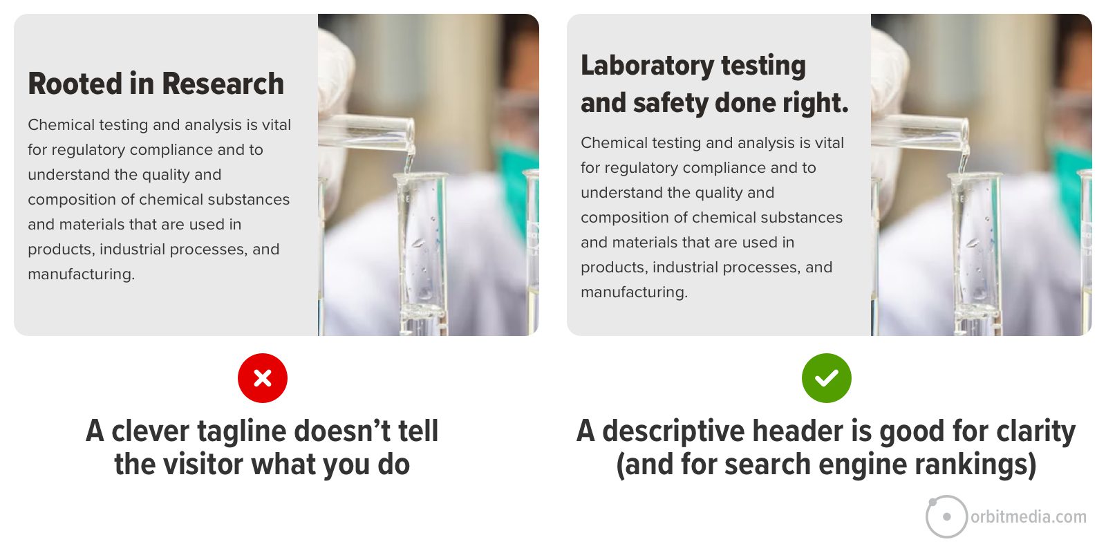
- Am I in the right place? What do you do?
Visitors need immediate confirmation. The header and first few sentences should clearly state the service. Not a vague benefit or clever phrase. Imagine meeting someone at an event and they ask ‘What do you do?’ Your H1 header should answer that question. - Is this for me? Who do you work with?
Specify your audience. Call them out directly, high on the page, with language like “for B2B marketers” or “designed for mid-sized manufacturers.” - How do you do it? How are you different?
This is your approach, your expertise, your process, your method. Whatever is unique or different about your approach must be highlighted and clear. - Who is behind this company?
Introducing team members with photos and bios humanizes your brand and adds trust signals. For details, they can browse the team pages in the about section. - What are the company’s values?
Once you’ve answered the key questions, some visitors may look for signs that you share their beliefs, that you’re on their team.
There are other common questions, such as: Who else do they work with? What do they think of this company? What are the results or outcomes? These are answered with evidence so we’ll cover those in a moment.
In each answer, be as specific as possible. Don’t be clever. Be clear. Because specificity correlates with conversion. Here’s an example from our guide on adding specificity. Compare the difference:
 | Els Aerts, AGConsult“A lot of people think adding copy means adding complexity and increasing mental load. By addressing your visitors’ actual objections and questions, well-written copy helps eliminate confusion and adds clarity. I love playing Which Test Won with this A/B test for Carglass. People invariably think the pared down version with less copy was the winner. It wasn’t. It was the text heavy version. Because that copy is not clutter. It’s clarity. It addresses people’s real objections and worries we found through user research.” |
Now for 1b, objection handling. This is key for conversion rate improvement. Because your visitor has doubts. Maybe they were burned before. Even after you’ve met basic expectations, you may still may get disqualified. Assume your visitor is looking for reasons to leave. The back button is calling.
Understanding the deeper concerns of your potential buyer requires research, interviews, data and possibly an AI-generated persona. But here are the common objections. Here are examples of the unasked questions and how to answer them.
- “This looks expensive. They’re probably out of our price range.”
Use data and examples that show value, calls to action that suggest price flexibility, ROI calculators or case studies. - “We don’t have time to go through this entire process.”
Use data and examples that show value, calls to action that suggest you can start right away, case studies that show a quick turnaround. - “They don’t work with companies like ours.”
Show your experience with a wide range of businesses and verticals. Lots of logos. Highlight “customization.” - “This may work for some, but we’re different.”
Write a sentence using the phrase “Even if…” Simply list the reasons that companies may not choose you and defeat them all.
 | Talia Wolf, GetUplift“While addressing your visitor’s questions and concerns, don’t forget: not all decision-making is conscious or rational. Much of what influences a buying decision lies beneath the surface; In emotion. Hundreds of A/B tests have shown that even when prospects don’t realise it, they’re always asking themselves two critical questions: How will I feel about myself after this purchase? How will others perceive me because of it? These questions reflect their self image and social image — powerful emotional drivers that have a huge impact in B2B buying decisions. Addressing logical concerns is vital, but great pages also tap into how they want to feel: accomplished, respected, smart, secure.” |
Talia wants us all to go deeper and connect with the emotional outcome the visitor is hoping for. If someone is saying “This looks expensive. They’re probably out of our price range,” what they may mean is “What if this doesn’t solve the problem, and I get blamed for picking the wrong tool?”
Speak to the emotional outcome and you’ll create a compelling motivation to act.
Second, Persuasion: The words you want them to see
They found what they’re looking for. They’ve decided that you may be a good option. Now you need to persuade them that you’re legit and that contacting you now is a good idea. It’s time to leverage trust and visitor psychology.
They didn’t ask for these, but you’re giving them these two things anyway. These are the two subrequirements of persuasion.
2a. Evidence to support your answers
2b. Triggers for cognitive biases
These are also closely related. Supportive evidence already triggers several cognitive biases (conformity bias, halo effect, authority bias, the availability heuristic) but since evidence is so important, we’ll keep it separate.
We’ll start with 2a: evidence. There are all kinds of supportive evidence you can add to a page for conversion optimization. We’ve listed 14 of them in our guide on adding supportive evidence. We’ll save you the click and summarize:
- Testimonials – Direct quotes from satisfied clients or customers.
- Client logos – Visual display of brands you’ve worked with.
- Third-Party reviews – Ratings and feedback from platforms like Google or Trustpilot.
- Case studies – Detailed stories of successful projects with before-and-after scenarios.
- Impact metrics – Quantitative results such as success metrics, ROI or performance improvements.
- Awards – Recognitions or honors received by your company.
- Expert endorsements – Recommendations from industry authorities.
- Certifications/Accreditations – Official credentials or standards met.
- Media mentions/Event participation – Appearances in press or involvement in notable events.
- Years in business/Size of operation – Longevity and scale of your company.
- Number of happy clients/Successful projects – Quantifying satisfied customers or completed work.
- Team credentials – Qualifications and expertise of your staff.
- Association memberships – Affiliations with professional organizations.
- Charitable contributions – Involvement in community service or donations.
The goal is not to use all of these. The goal is to back up your claims. Can’t use testimonials? No problem. Use something else.
Where to put your supportive evidence
Placement determines visibility. Ideally, your best evidence in the most visible places. Why put billboards on backstreets? Put them high up on the most visited pages. This is why putting trust seals (logos, awards) above-the-fold on the homepage is so common.
Placement also determines context. Ideally, relevant evidence is placed right next to the marketing claim it supports. If your page talks about quick response times, put your “that was fast” testimonial nearby. Your proof points belong on the pages about that service.
This is especially important for search optimized websites. When your entire sitemap is aligned with phrases, then visitors enter all over the place. Lots of pages are landing pages. Many visitors don’t see those great testimonials and awards you have on your homepage. That’s why even deep interior pages need evidence. Your homepage is just one of many landing pages.
You didn’t add proof to it because it’s your homepage. You added proof there because it’s an entry point.
Now add proof to all of your other entry points.
Conversely, putting all of your proof on a separate page, such as a testimonials page, hides that evidence. Visitors rarely visit testimonials pages. They came for answers, not evidence. And if your best testimonial is on page four of a PDF case study, you hid it well. Few visitors will ever see it. Make every page a testimonials page.
 | Joanna Wiebe, Copyhackers“Proof should always prove something. The more closely tied your proof is to a claim or message, the more likely it is to work. To make sure your proof is proving something important, try the PCPO framework, which I especially like to use for on-page body copy blocks. It goes:
Repeat PCPO throughout your body copy sections. Focus on proof of the cure.“ |
How visible are your proof points?
You can estimate the visibility of anything on your website using analytics tools. Use GA4 to check the percentage of visitors who visit that URL and use a scroll heatmap tool to see what percentage of visitors made it to that scroll depth.
For example, 8% of our visitors go to our web development page. That page has a row of awards right below the fold. According to the scroll heatmap in Clarity, 75% of visitors scroll down on that page. Now I know what percentage of visitors see those trust seals.
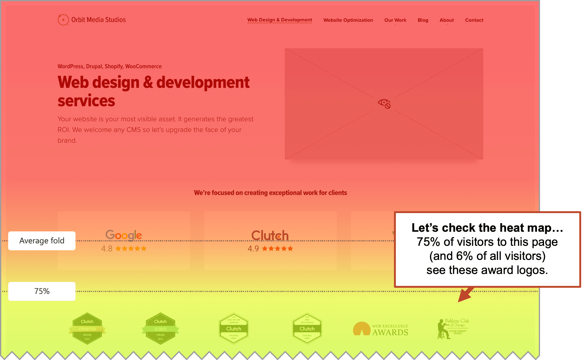
In our experience, putting anything below the fold reduces its visibility by 25-50%.
When we redesign B2B lead generation websites, we first audit the current site. Often we find strong evidence on the site, but it’s at the bottom of a PDF case study, linked to from a rarely visited page.
Triggering psychology and cognitive bias
Now we move on to 2b, the final factor in conversion: psychology. They found the answers to their questions, they see reasons to believe you’re legit, Now they are weighing the decision: Should I take action now, or keep looking?
To maximize your chance of generating the lead right now, in the moment, you need to tap into those hardwired decision-making shortcuts. The cognitive biases. These are invisible nudges that increase urgency, lower perceived risk, and build trust.
Marketers leverage all kinds of cognitive biases, going back to the early days of advertising and direct response copywriting. Here are six biases and phrases that trigger them:
1. Loss aversion
Your visitor fears loss more than they desire gain. So remind your visitor what they’ll miss, risk or lose by not contacting you today.
- “Still showing your visitor outdated webpages?”
- “Every month without a better site is a month of lost leads.”
2. Prescriptive norm bias
Your visitor feels entitled to certain results. So use language that suggests what people ought to do or have. State that the result of your services is the proper or normal condition. The outcome of your work is simply the expected standard.
- “Your website should be your top-performing sales rep.”
- “Every credible brand today has a website that builds trust. Yours should too.”
2. Authority bias
Your visitor tends to trust statements when you frame them as facts. So use a tone of certainty and finality. It can make a statement harder to argue with. It feels expert. And everyone wants to believe that they make rational decisions, based on facts.
- “The truth is that most website redesigns don’t drive leads, they’re just a branding refresh.”
- “The real problem isn’t your design — it’s that your copywriting has nothing to do with conversion.”
3. Effort justification (cognitive dissonance)
Your visitor has probably tried to solve their problem already, but those efforts didn’t pay off or they wouldn’t be here. So use language that highlights the gap between their efforts and outcomes. Contrast what they have with what they need. Their action resolves this tension.
- “You already have dashboards, but you’re still not getting insights”
- “You’ve invested in traffic. Now it’s time to invest in conversion and lead generation.”
4. Anchoring effect
Visitors rely heavily on the first piece of information we see. So show the less ideal item first. The comparison makes the second option look more appealing.
- Time anchoring: “Most agencies take 12 weeks. We launch in six.”
- Price anchoring: “Normally $2,000 — now just $799.”
5. Self-identity / Consistency bBias
Your visitor is motivated to act consistently with their self-image. So use language that appeals to how they see themselves. People respond to messages that affirm their identity.
- “For results-focused marketers like you.”
- “You care about data-driven decisions. Your website should reflect that.”
6. Urgency / Scarcity bias
Your visitor is more likely to act when things are in short supply. It makes things feel more valuable. So use language that reminds them that time or capacity is limited.
- “Next start date for new projects is June 1st”
- “We take on 3 new clients per month”
Fun to break down lead generation into a four-part framework. But of course, we left out a lot. Let’s head off those comments and handle some of your possible objections and questions now…
What about storytelling?
It’s important, right? Why wasn’t it mentioned?
Again, watch a dozen session recordings of the last dozen leads you generated. How many stories did those new leads read? The answer is probably zero. If they read a story, it was probably a case study.
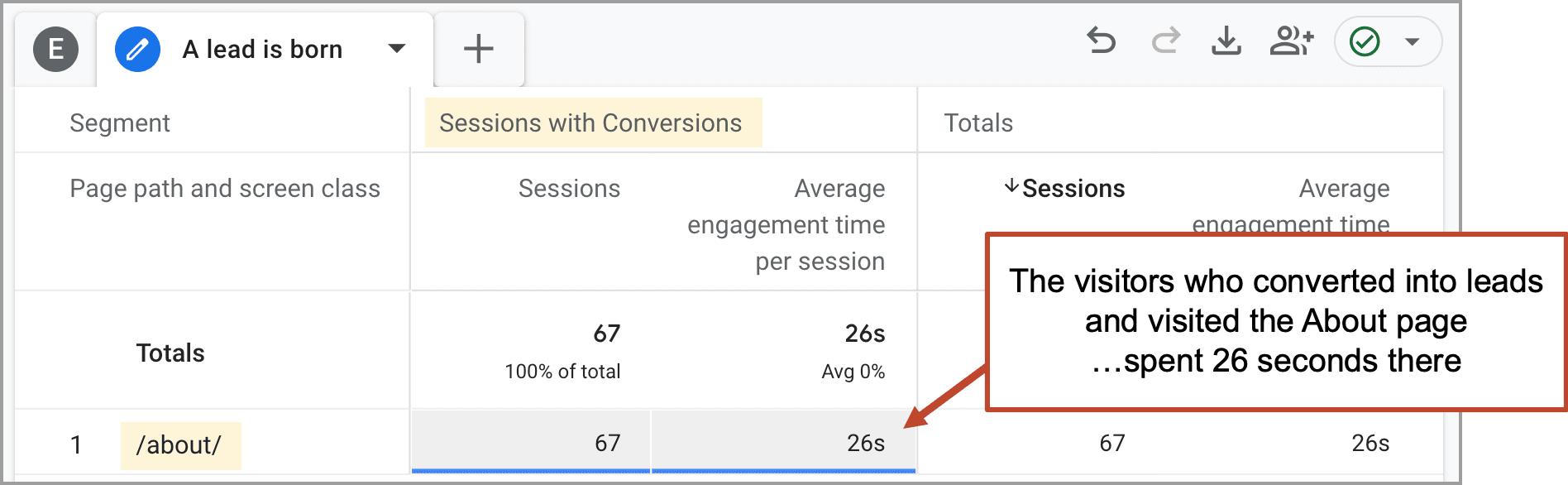
You may have a nice story on your About Us page, but the visitors who convert may not even visit that page. If they do, they may not hang around for storytime. You can check for yourself in GA4. I’m not saying that About pages aren’t important. They are, in fact, critical. I’m simply suggesting that your typical lead isn’t looking for a story. They’re looking for answers.
Brand and storytelling are critical. They support lead generation in all kinds of ways: referrals, word of mouth, direct traffic, repeat visitors, social media marketing and more.
But storytelling doesn’t show up much in the do-or-die moment of converting website visitors. Your visitor is moving very fast. They land on a page (it may not even be your homepage) they scan, click a page or two and then decide: click the call to action or bail.
The typical B2B visitor who converts into a lead:
- Visits an average of three pages
- Spends less than 2 minutes on your website
- Reads none of your articles
I’m not suggesting that we stop telling stories, publishing articles and building brands. I’m just reminding you that your most important visitor, the visitor with the strongest intent, is mostly just scanning your key pages for answers to their key questions.
What about button color?
Sure. Go ahead and set up an A/B test of button colors. But it’s not likely to drive a big lift in your key event rate. Imagine your visitor in the moment of truth, their questions answers, your assertions supported, their mouse hovers over the button…
“They look like a good fit for our needs, but the button is blue. I’m really looking for an orange button.”
What about form optimization?
Yes, forms with many fields may have lower conversion rates. Don’t use greedy forms. But remember, in B2B, the visitor is often trying to solve a big problem. They may be ready to make a big investment of time and money. Are a few extra form fields likely to stop them from proceeding?
Form friction is a problem, but it’s a big problem for impulsive, discretionary decisions. For high-consideration B2B decisions, their intrinsic motivation and your perceived fit are the key factors. It’s worth A/B testing your contact form submission rates, but first check your conversion copy for clarity and persuasion.
What about calls to action?
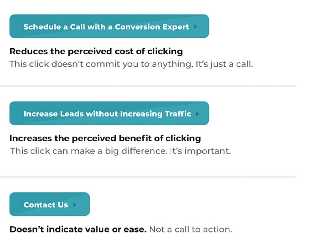
Calls to action matter and conversion optimizers can make a difference. You goal is to design high click through rate CTAs. Here are a few tips based on the words, not the colors, in your calls to action.
- Do the verbs make the action seem sound easy, and a low commitment?
- Do the verbs make the action sound valuable, and likely to help solve their problem?
Just like any link anywhere in digital marketing (search results, social streams, email inboxes), your visitor is doing a split second cost/benefit analysis before they click. If you reduce the perceived cost or increase the perceived benefit, you can improve the CTRs on your CTAs.
Never underestimate how transactional your website visitor is in the moment of decision
You may have a super high-consideration offer (ERP software) or even a lifetime decision (senior living communities) but your visitor isn’t making the big decision during their website visit.
You aren’t trying to sell them anything. They aren’t here to buy.
You’re trying to convert them into a lead. They’re considering getting in touch.
Your visitor is scanning fast, looking for answers.
They slow down if they find what they’re looking for. (1a)
They get confident if you handle their concerns. (1b)
They believe you if your messages are well supported. (2a)
They convert if this seems like a good time to start the conversation. (2b)